Ermine
Scope of works
- Naming
- Art Direction
- Branding
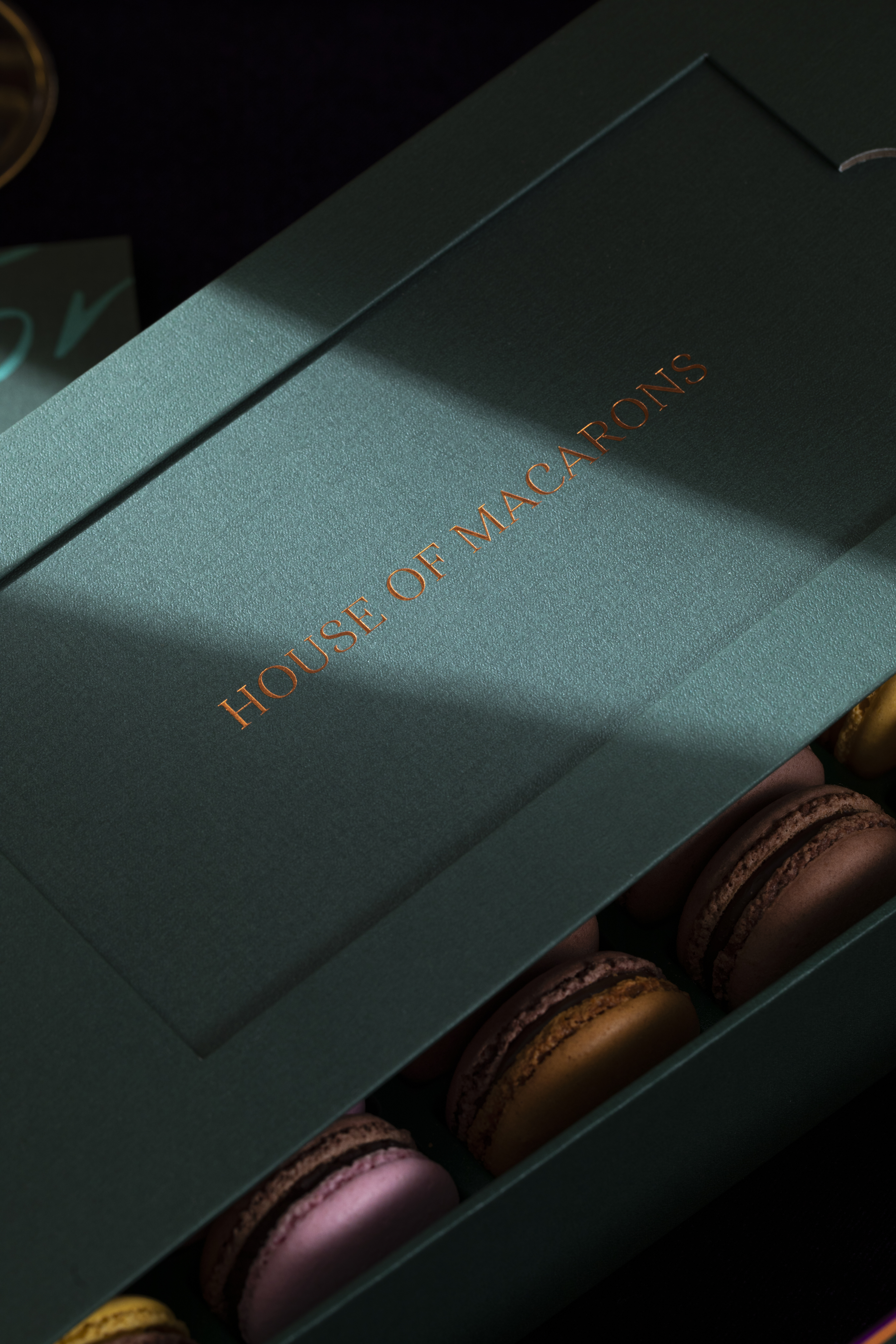
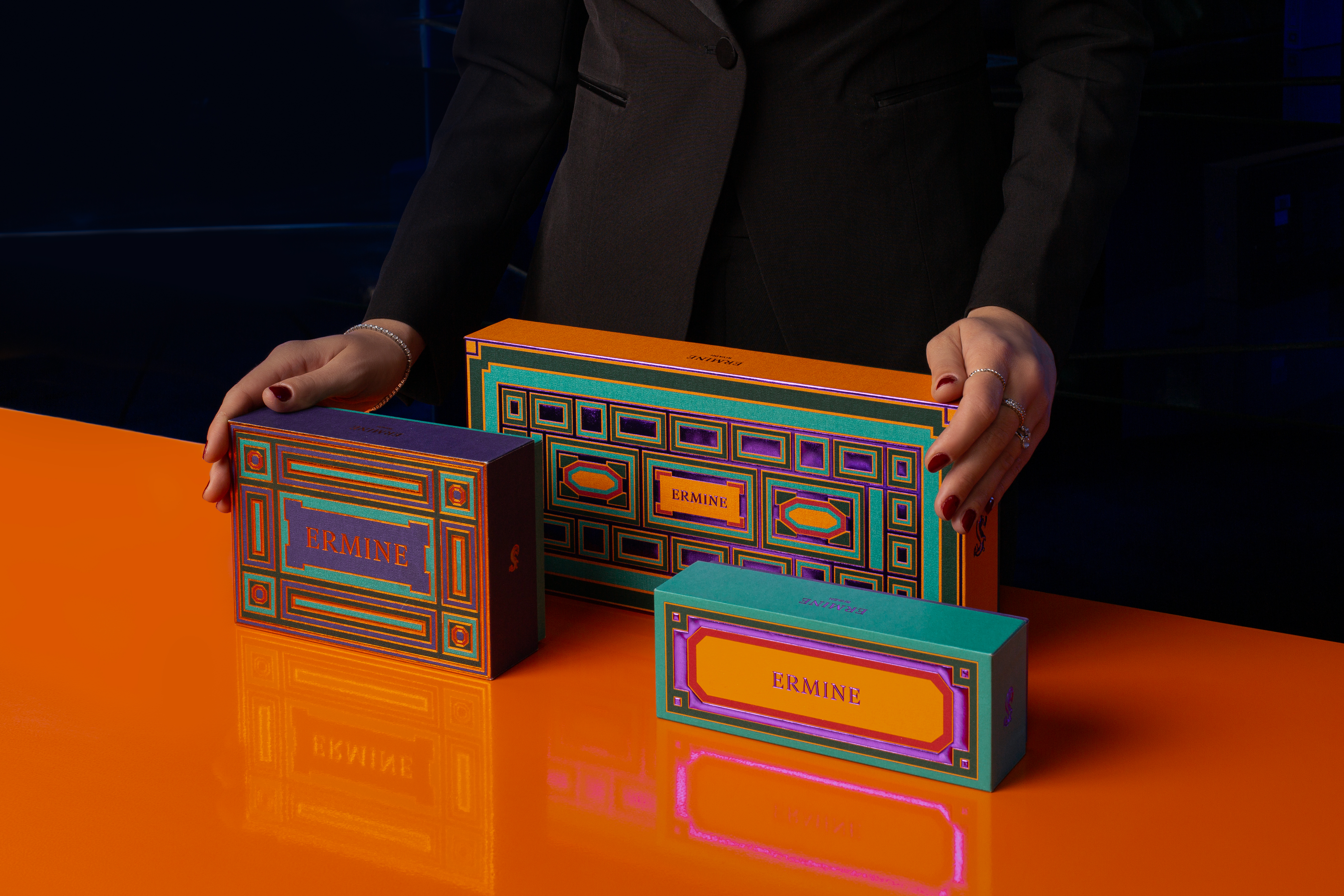
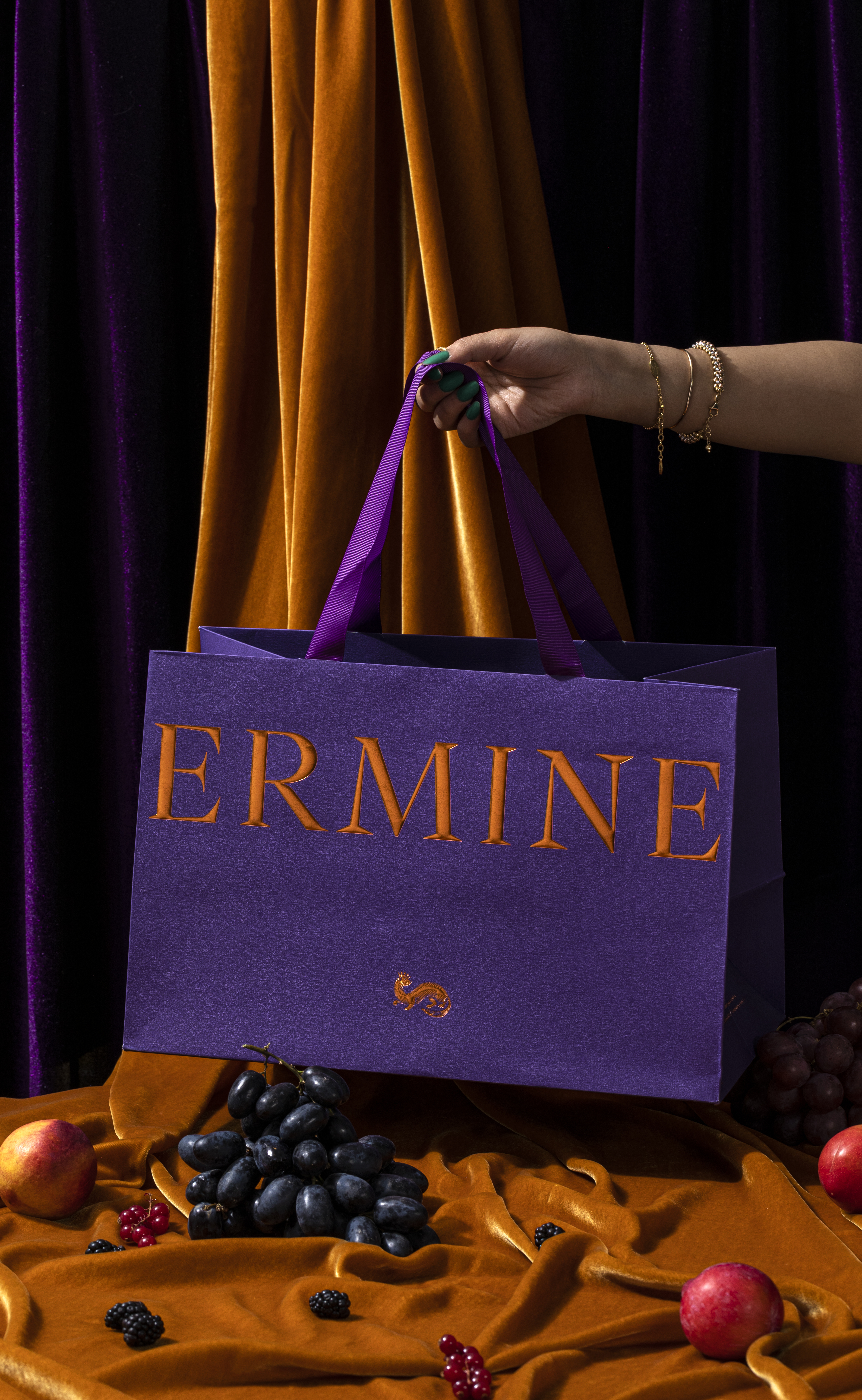
- Packaging
- Brand Guideline Manual
Client:
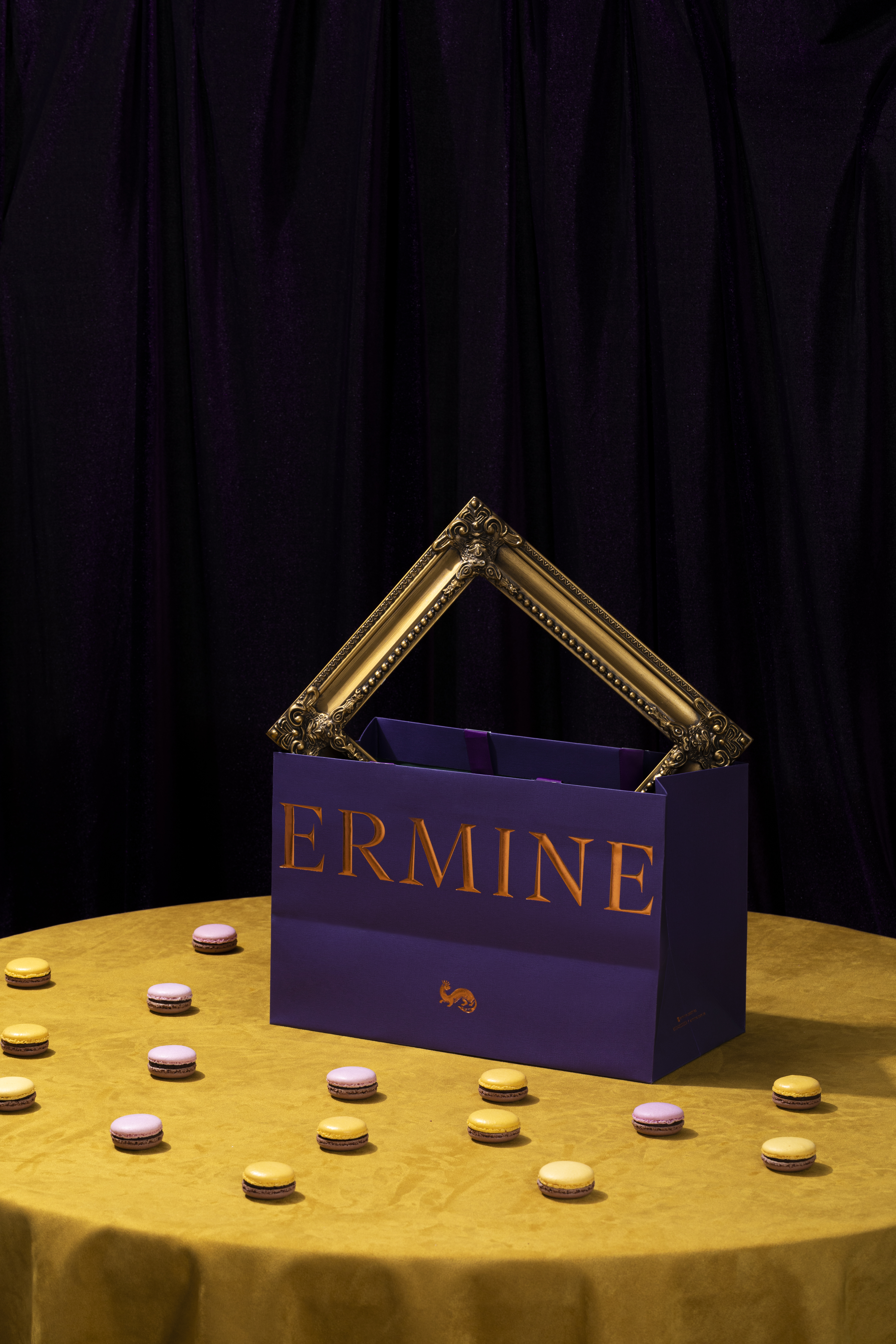
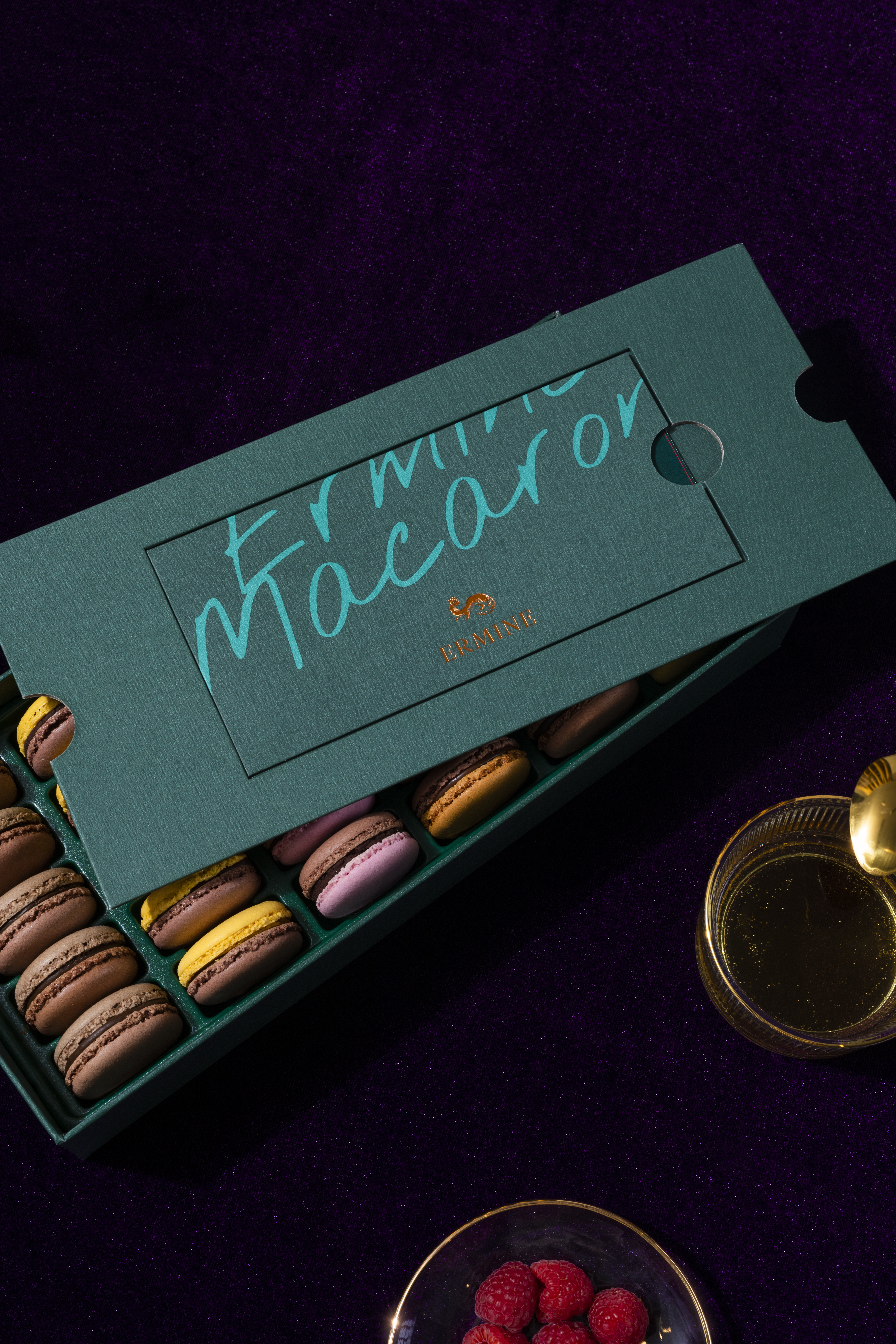
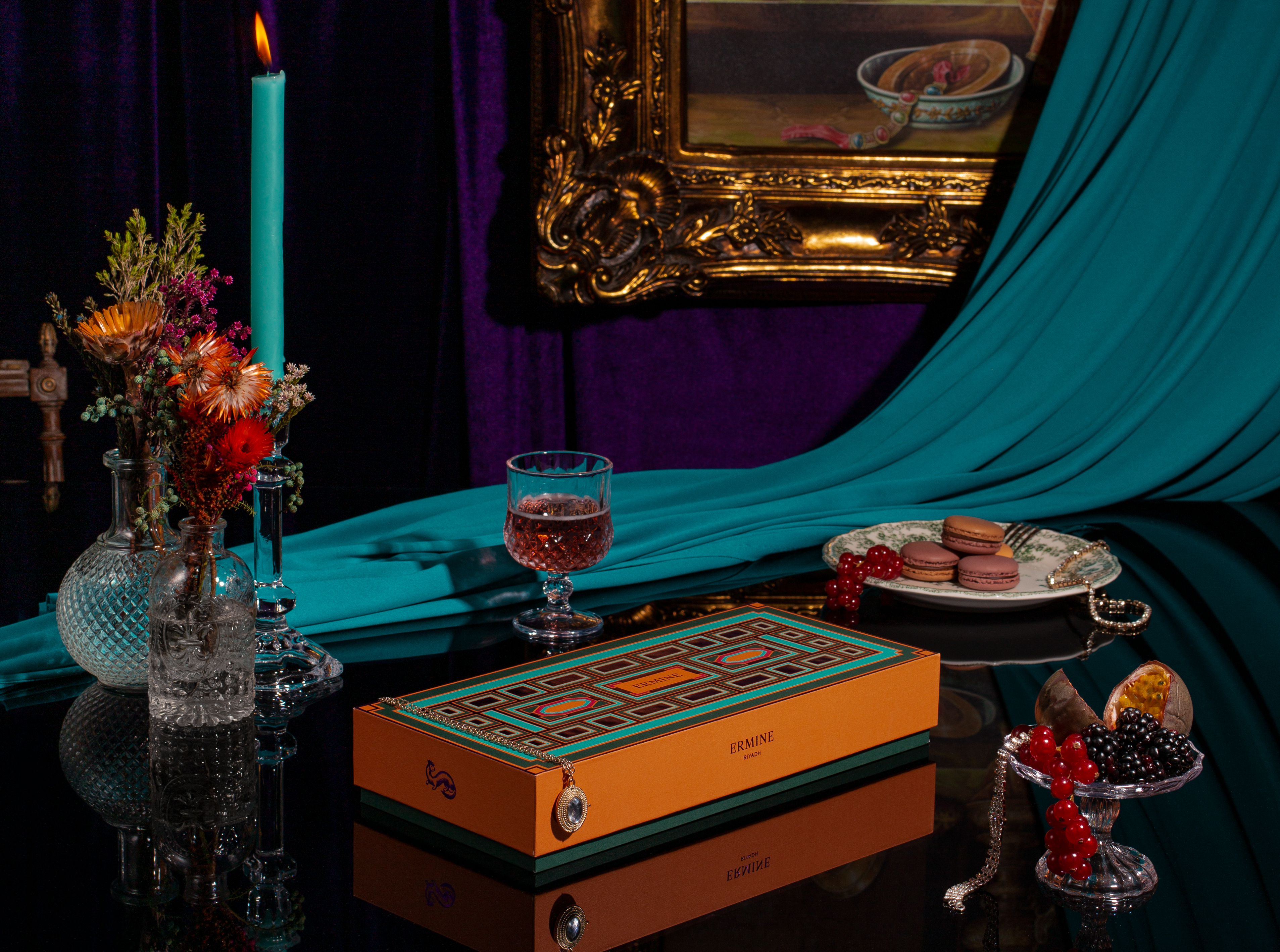
Ermine is a high-end French pastry brand based in Riyadh, inspired by the extravagance and avant-garde spirit of 17th-century France. The macaron is a metaphor for unlimited creativity, requiring real expertise to combine the texture of the shell with a generous ganache to create an emotional experience.
Objective:
The objective was to create a brand identity that would reflect the macaron's experience and softness while communicating the culture surrounding these pastries and providing a unique and indulgent experience for its customers.
Solution:
At TOLD, we created a brand identity starting with the name, drawing inspiration from an iconic symbol of royalty and France: the ermine. We reflected on the animated behavior of this graceful animal and its symbolic significance through the use of bold colors and typography while exuding a sense of luxury and sophistication. The brand mark features a stylized ermine that is both regal and playful, evoking a sense of joy and indulgence that is synonymous with Ermine's pastry offerings. We stylized French baroque elements from architecture and lifestyle in a contemporary way, bringing to the present the lavish and decadent environments where celebrations were held.
|
|
|
|
|
|
|
|
|
|